Timeline
December 2022 - January 2023 (4 weeks)
Role
UX/UI DESIGNER, RESEARCHER
Tools
FIGMA, PHOTOSHOP, CANVA, USERTESTING.COM, GOOGLE MEET
Overview
O'Kibbles, a specialized e-commerce app for ordering high-quality dog food quickly and conveniently, was launched to bridge a gap in the market and serve busy dog owners. This case study outlines the app's design, features, target audience, marketing strategy, and performance.
Problem
Difficulty Accessing Quality Dog Food for Busy Owners
Existing dog food purchasing apps are cluttered and unintuitive, making it difficult for busy owners to find and buy the high-quality food they need.
Specific problems included:
Small text and vague header labels
Inefficient navigation
A complex checkout process
These inefficiencies create high user friction and complicate a simple process, resulting in low conversion and high cart abandonment rates.
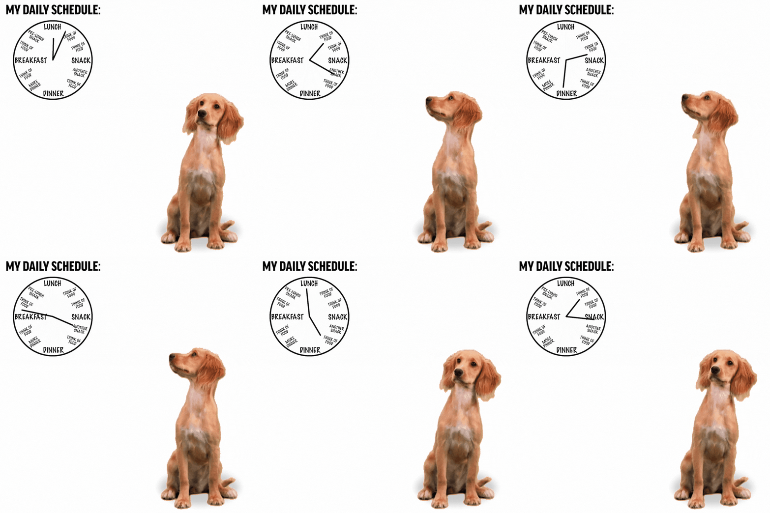
"I'm not staring at the clock; I'm giving it puppy eyes, hoping it'll speed things up."
Constraints
Design Constraints for the O'Kibbles E-Commerce Dog Food App
There were three main design constraints that we had to deal with during the development of the O'Kibbles E-Commerce Dog Food Purchasing App:
User Feedback: We had to carefully consider the feedback from our users throughout the design process. This meant balancing the must-haves from the nice-to-haves, and not taking all feedback to heart.
Brand and Style Guidelines: We had to adhere to O'Kibbles' existing brand and style guidelines. This meant that we had to design the app in a way that was consistent with the O'Kibbles brand identity.
Project-Specific Design Constraints: We had to design the app for use on mobile devices, and we had to make sure that it was easy to use for people of all ages and abilities.
The Solution
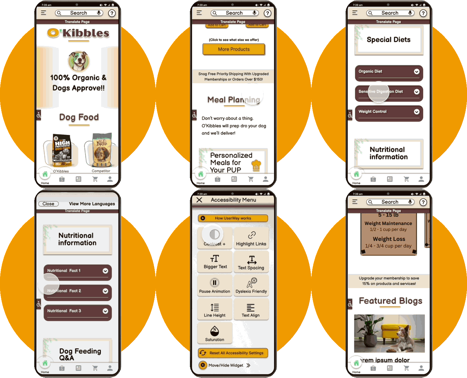
Tailored Features: O'Kibbles Solution for Busy Dog Owners
Accessibility
Ensuring that the app is user-friendly for all.
Large text for clear readability.
High color contrast to enhance visibility.
Increase spacing to allow “breathing room” between sections.
Prominent navigation drawer menu offering enhanced accessibility features for users.
Smooth Navigation
Simplified browsing experience.
Visually appealing, fixed footer menu with color, labels, and feedback animations to emphasize screen selection and maintain user orientation.
The jump category feature provides instant access to popular product groups.
Blog section that provides product information, pet diets, and pet food recommendations.
Easy Checkout and Payment
Smooth and secure checkout process.
Multiple checkout points to reduce time spent on transactions.
Pickup and Delivery options for user convenience.
Secure payment portal to ensure confidentiality and safety.
Success confirmation for reassurance and clarity.
WHITE PAPER RESEARCH
Digital Shift in the Pet Market: A New Era Emerges
From 2015 to 2020, U.S. online pet product purchases skyrocketed, with a growth from 8% to 30%. Market leaders Amazon and Chewy captured 59% and 41% of these online sales respectively, underscoring the digital transformation in pet commerce. The COVID-19 pandemic only intensified this shift.
"Online pet product sales are booming, with e-commerce projected to account for half of all spending by 2025." - Cited from Packaged Facts, U.S. Pet Market Outlook 2021-2022.
[Check out the complete article.]
Why do Cart Abandonments happen?
“28% of shoppers abandon their carts because the checkout process is too long and confusing. ”
Complex checkout process: Customers are more likely to abandon their carts if the checkout process is too long and confusing. This can be caused by factors such as having to create an account, enter too much information, or navigate too many screens.
Initiative navigation: Customers should be able to easily find their way around your website and navigate to the checkout page without any difficulty. If they have to search for the checkout page or if the navigation is confusing, they are more likely to abandon their carts.
Cluttered screens: Cluttered screens can be overwhelming and confusing for customers. Make sure that your website is well-organized and that the checkout process is easy to follow. Avoid using too much text or too many images on the checkout page.
[Check out the complete article.]
Understanding the Competition
By analyzing key players like The Farmers Dog, NomNom Now, Pet Plate, and Chewy, we identified a spectrum of strengths and gaps across essential features. This evaluation provides valuable insights into areas of opportunity for O’Kibbles to differentiate itself and better cater to the needs of its users.
Closer look at our competitors
User Interviews
User Feedback: Guiding O'Kibbles' Features
Our research began with interviews of 5 users regarding their experiences with other companies when ordering pet food and managing payments. By focusing on these broader insights rather than solely on O'Kibbles, we were able to make informed decisions about the essential features that would best serve the needs of our target audience.
As one user put it, 'Navigating through pet food options can be a maze. A more intuitive interface would be a game-changer.' This sentiment was echoed throughout our interviews. Notably, 85% of users emphasized the importance of a secure payment gateway, while 70% wished for a faster checkout process.
A few questions that were asked during the interview include:
Can you describe any challenges you've faced while buying products online?
Were there times when the content on a website was hard to read or understand?
Have you experienced any difficulties with navigating through a website?
Did a complicated checkout process ever deter you from finalizing a purchase?
As someone with a tight schedule, what changes would make your online shopping more convenient?
Once I have a better understanding of the user's overall experience, I can then ask more specific questions about buying dog food online. For example:
What information is most important to you when you are buying dog food online?
How do you typically compare different dog food brands?
What factors influence your decision to purchase dog food online?
What changes would you make to the checkout process to make it more convenient?
What other features would you like to see in a dog food app?
O’Kibbles User Persona
IDEATE
Diving Deep into O'Kibbles' Brainstorming
In the ideation phase, numerous ideas emerged as we aimed to refine the user experience. While we couldn't incorporate all, here are some highlights from our brainstorm:
Category:
Considered a dynamic categorization based on dietary needs.
Explored a 'favorites' section for quick repeat orders.
Thought about integrating user reviews and ratings within categories.
Checkout:
Looked into a one-click checkout for returning users.
Thought about integrating multiple payment gateway options.
Contemplated on embedding a live chat support during checkout.
Navigation:
Gesture-based navigation for seamless browsing.
Evaluated the inclusion of a 'recently viewed' section.
Convenience:
Brainstormed on personalized product recommendations based on past orders.
Weighed the idea of a quick reorder feature.
This sessions was instrumental in refining O'Kibbles' design and functionality.
Design
Iterative Sketching Process
I begin with hand-sketching five versions of each screen. After pinpointing standout features, I consolidate these into a sixth definitive sketch. Only then do I transition to crafting a digital wireframe.
From Sketch to Structured Design: Introducing Our Mid-Fidelity Wireframe
Transitioning from hand sketches, we progressed to low-fidelity wireframes, setting the stage for the visuals seen in our mid-fidelity representation below.
Overcoming Design Obstacles for Enhanced User Experience
During the app's design phase, several challenges emerged:
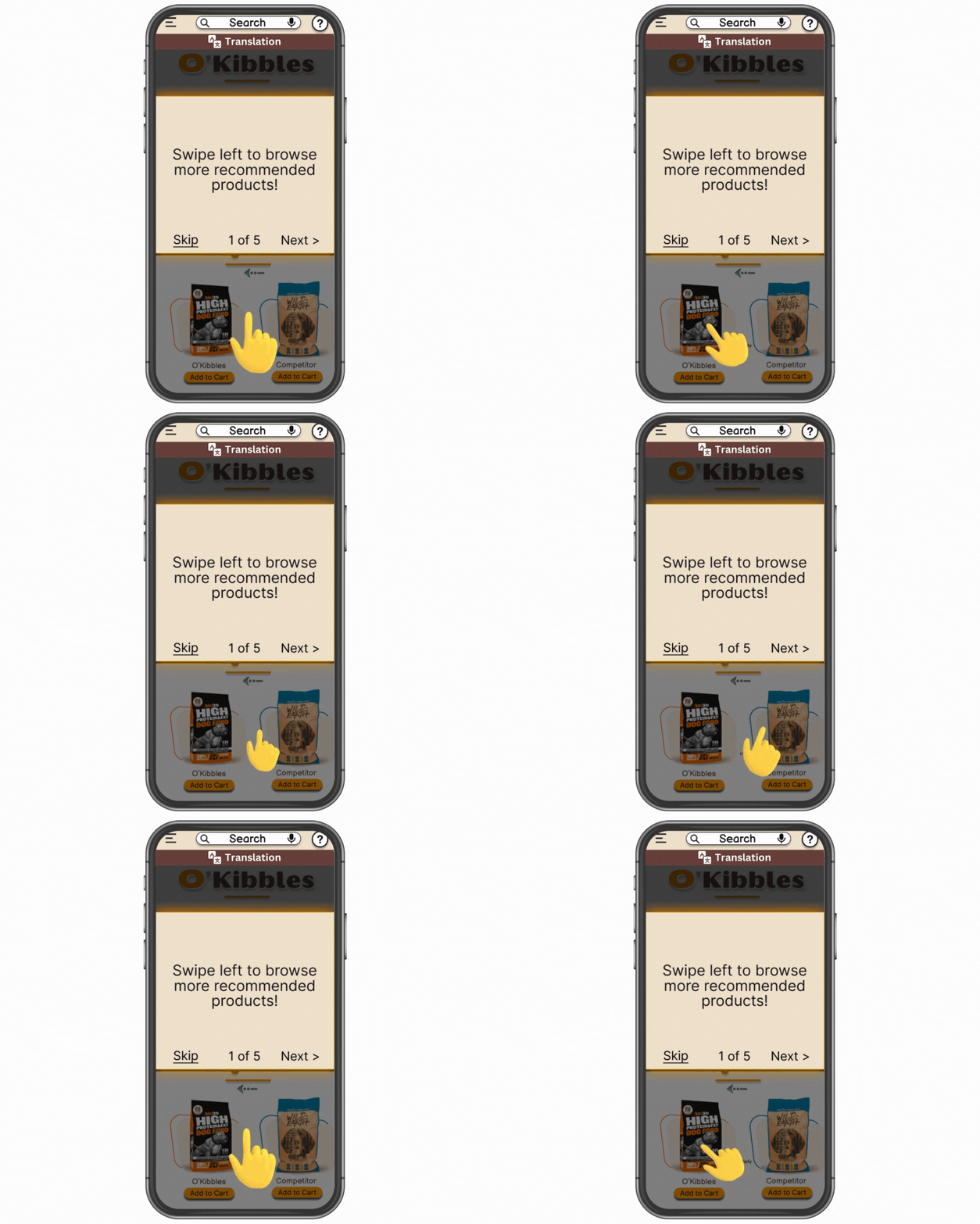
User Onboarding Dilemma: Initially faced with the choice of a minimalist interface or the inclusion of a tutorial for newcomers, I ultimately integrated a user-friendly tutorial, emphasizing a smooth entry experience for new users.
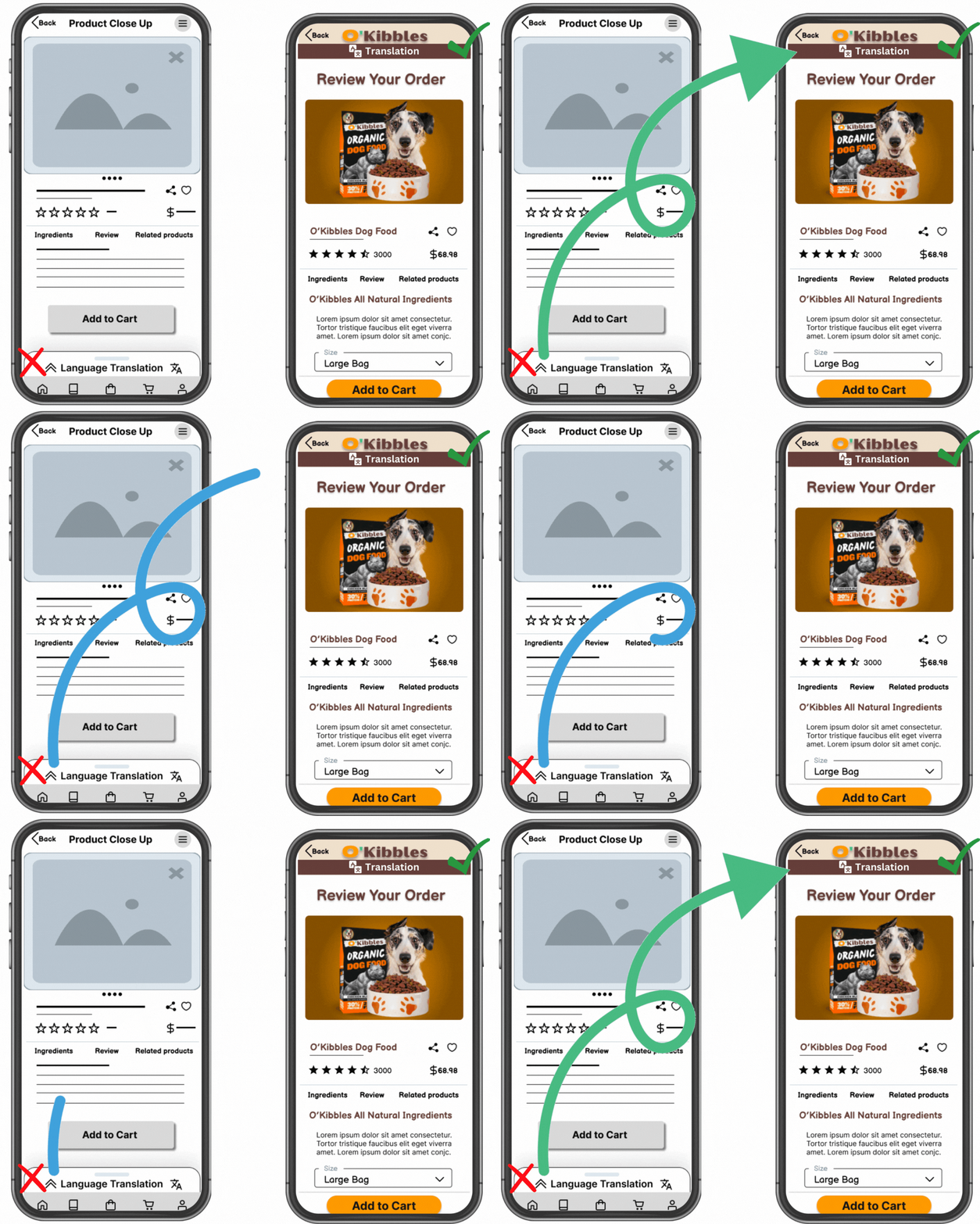
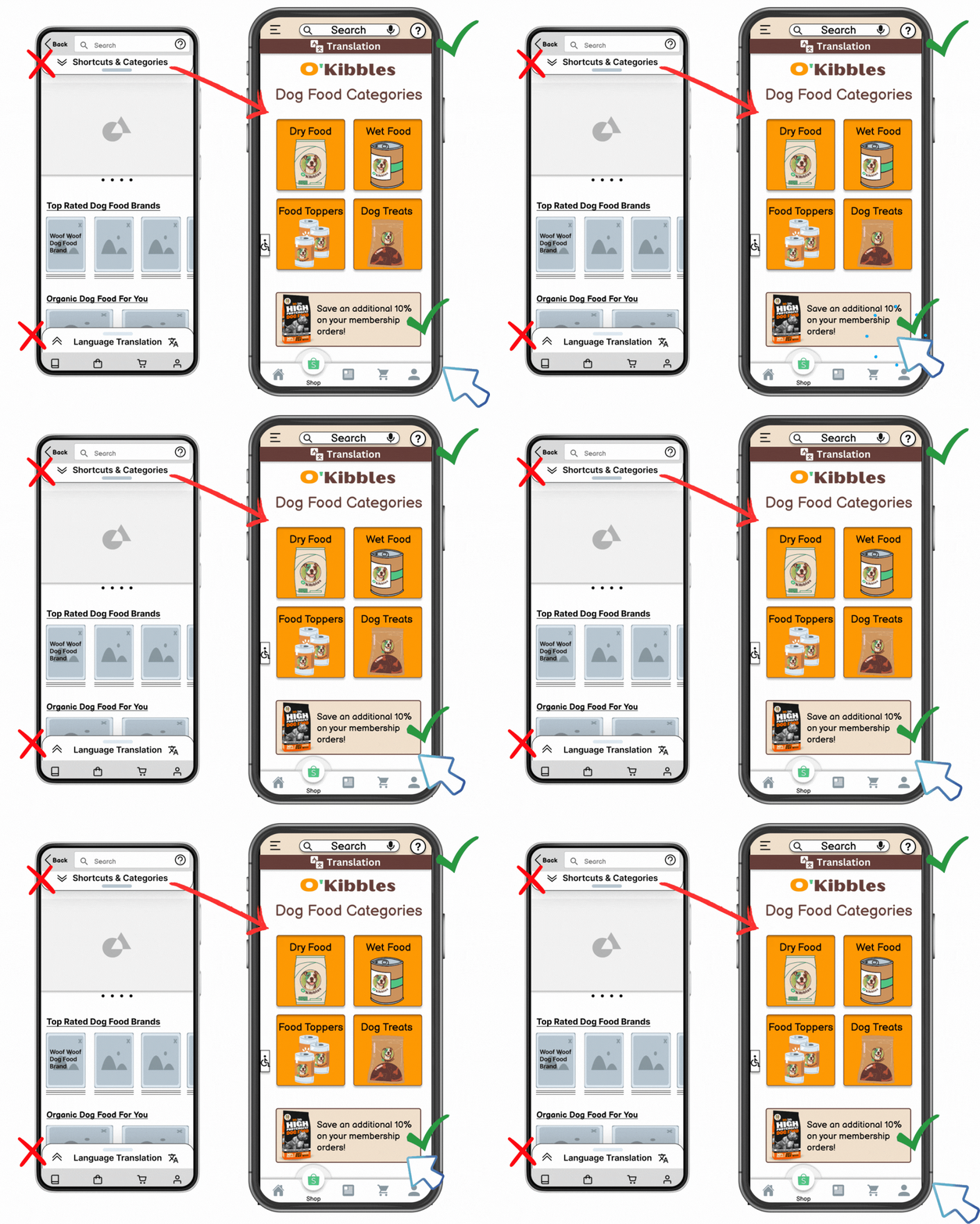
Language Accessibility: Originally, the design had the language translator positioned as a bottom pop-up. I moved its placement to a prominent top-screen dropdown for enhanced visibility and user convenience.
Navigation Enhancements: To further refine the user journey with a dynamic element, a fixed animated navigation menu was integrated into the app.
Sales Promotions Visibility: To cater to budget-conscious customers, I chose to highlight prominent sales promotions, ensuring visibility while maintaining a clean interface.
TESTING + IMPROVEMENTS
3 main iterative enhancements in my design
Over a 2-week period, informed by feedback from 5 peers, I made refinements to my design. This iterative process led to three significant improvements in the app's functionality.
1) Accessibility and Usability Enhancements.
Introduced header labels in compliance with WCAG standards.
Achieved a 9.68 contrast ratio to enhance readability and align with A11y standards.
Repositioned the translation bar for optimized user access.
Amplified product listings with comprehensive descriptions and ingredients, aiding informed purchases.
2) Improved Navigation and Speed
Replaced the top category drop-down with immediate-access category buttons, facilitating quicker navigation.
Introduced a fixed menu, offering direct access to the cart, thereby expediting the checkout process.
Integrated promotional sales banners to boost conversion rates and cater to budget-conscious customers.
3) User Assistance and Clean Interface
Integrated an interactive 5-screen onboarding tutorial for a smoother user introduction.
Positioned a help button at the top of the screen for FAQ and answer.
Introduced a search bar for efficient product or information retrieval.
Final product
Try out the O’Kibbles app and explore our products. I'd love to hear your feedback!
Final Results
O'Kibbles App Post-Launch Performance
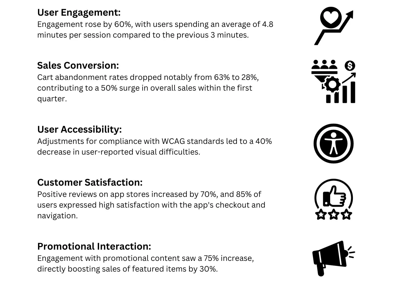
After implementing user feedback, the O'Kibbles app saw significant performance gains across key metrics:
Reflections + Lessons Learned
The key takeaways
During the O’Kibbles app project, I realized:
Adaptability is Key: UX design changes constantly. It's about adapting based on user feedback. Aim for usability over perfection.
Empathy Matters: While research offers data, truly understanding users means stepping into their shoes. This deepened my commitment to empathetic design.
Aesthetic and Function: O’Kibbles taught me the importance of combining good looks with smooth functionality. This will guide my future design projects.
These insights reinforce my dedication to user-focused design, always prioritizing their needs in any digital solution.
For more work inquiries, or if you'd like to grab a coffee and chat, feel free to email me at wnoelux@gmail.com ☕️✨
Thank you for reading! 🧠

